How to color with markers | COPIC vs. AD CHARTPAK | Fashion Drawing | Justine Leconte – Justine Leconte officiel
Video
https://www.youtube.com/watch?v=Gd3JOQ6ux2k
Summary
### Summary
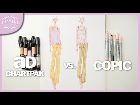
In this video, Justin discusses his journey of starting YouTube two years ago and shares a tutorial on using different marker brands – Ad Markers and Copic Markers. He demonstrates drawing with both brands and talks about their differences in application, blending, and overall color intensity. He also provides information about the markers‘ tips and how they affect the outcome of the art.
Highlights
- Two year YouTube journey
- Tutorial on using Ad Markers and Copic Markers
- Differences in application, blending, and color intensity
- Information about markers‘ tips
Key Takeaways
- Using Copic Markers vs. Alcohol-Based Markers: Copic markers allow strategic shadow placement and smooth gradients, while alcohol-based markers hold their marks when dried.
- Blending Colors with Copic Markers: A three-color effect can be achieved by blending between two colors.
- Adding Contrast with Alcohol-Based Markers: Alcohol-based markers provide brightness and depth in illustrations.
- Tone-on-Tone Shadowing: Test shadowing with the same color, but consider using a darker shade or gray for visibility.
- Creating Art with Watercolor and Fabric: The textured surface of watercolor painting looks like a watercolor work; Copic and Chartback markers are compared for blending colors and texture control.
Schreibe einen Kommentar